
Web based Mail App
Chainmail
A secure web based mail client
The below case study explores the UX/UI process for the design of a secure mail client from inception to a design solution.
Chainmail
A Mail Web Client
Duration
February 2022- April 2022
Background
This project was done as part of the coursework for the UX design Course at the University of Cape Town. The project follows the UX process from inception to High Fidelity wireframes. I subsequently designed the User Interface designs to see the project through as a final design solution.


Chainmail is a web mail client seeking professional UX input to make their site more user friendly whilst increasing the safety, security and privacy of their mail offering for their customers. The overall aim is to deliver a professional communication tool with excellent security and privacy measures. Another key aim is to design an interface for Chainmail that is trendy and innovative and facilitates faster sign-ups.
Brief
Problem Statement
Chainmail customers often comment that the mail service doesn’t “feel” completely secure and that the interface is outdated.
High Fidelity Wireframes
Wireframing and prototyping was done as a way of testing out the accumulation of the user research done and ironing out any flaws in the usability/ design/ navigation of the interface. This revealed the few outstanding features that the ChainMail user desires as well as aspects such as confirmation pop-ups specifically related to security being of use to a ChainMail client that wouldn’t have generally been required by a generic email user.
Following the first round of wireframes, the clickable prototype shown in the video below was tested on users and the wireframes were further refined after this.


Design Solution
UI Designs
UI Designs
The UI design strategy that I explored was predominantly to address the issue of the interface feeling outdated. I addressed this by implementing a simple, bright colour scheme. The colour blue was chosen as the main colour as it evokes a sense of trust and security for the user. The Interface is designed in a way that is familiar to the user as well as feeling clean and minimal and easy to navigate.


Design Research
Research, Analysis and Structuring
The users of the ChainMail web client are professionals and everyday users who are aware of and emphasise safety, security and privacy above all else. ChainMail customers want to be able to easily and safely send, receive and store mail and documents on an interface that is visually appealing, simple and intuitive to use. ChainMail clients want to be reassured by the interface that their information is safe along their journey.
Usage Hypothesis
Empathy Mapping
I put together an Empathy map to better understand the end-user, what they may think, say, do and feel. This was conducted as a way of uncovering missed opportunities for the design solution to best cater to what the user really needs and to provide the best user experience overall.

Methodology
Building a product-use context which involves discovering the user personas as well as formulating an initial usage hypothesis.
Stakeholder discovery and analysis involving interviews of stakeholders and identification of their key objectives.
User recruitment and user testing involving users testing various ChainMail competitors as a way of discovering what the user did/ didn’t like/ what they struggled with.
Evaluation and cross-analysis of hypotheses’ using a hypothesis Evaluation matrix as a way of discrediting or confirming assumptions of the product.
Unpacking and Briefing the aesthetics of the User experience and explaining in depth the design intent to the Visual designer.
Wireframing using the software “Figma” the first wireframe mock-up was done to begin unpacking the functionality of the site and the features and navigation requirements.
Final Design Solution as integrated UI designs.
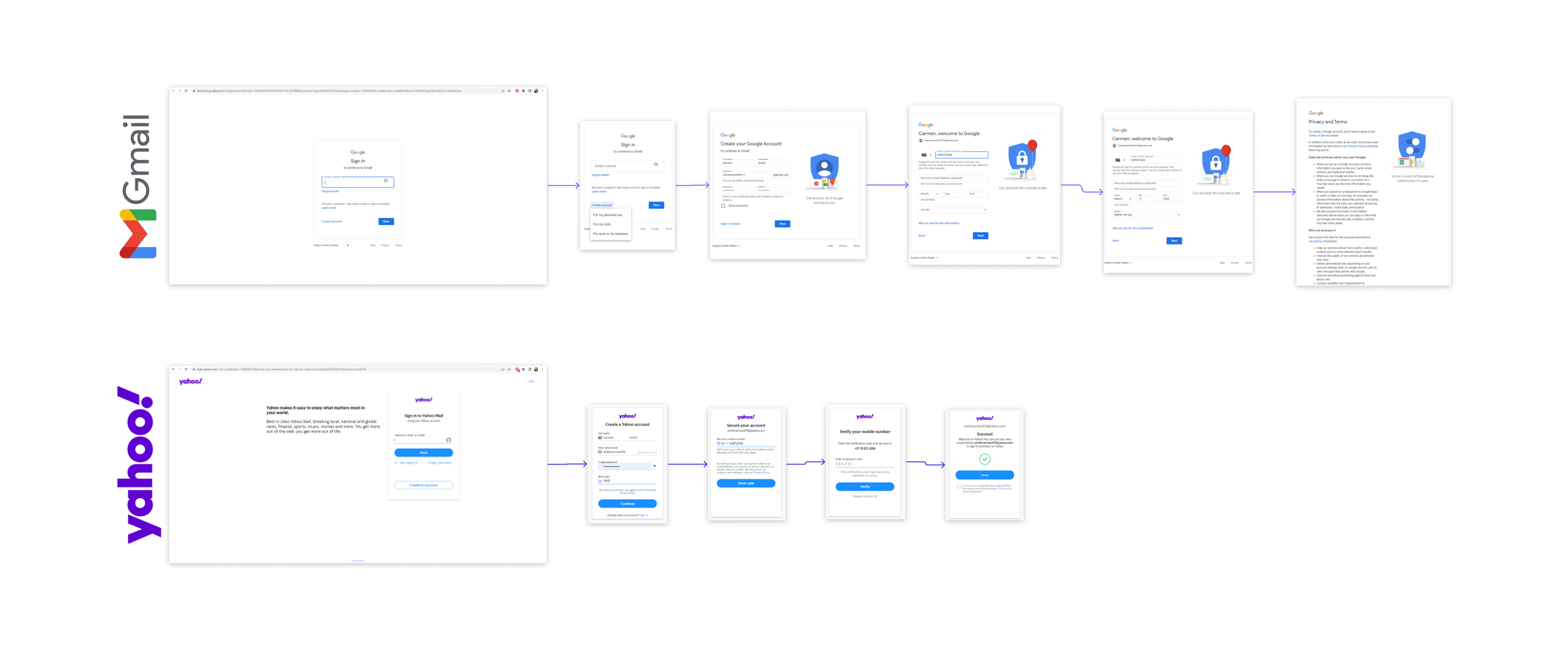
Multivariate Testing
Multivariate testing was done with two users over two platforms. The aim of the tests was to get the users to sign up to two different mail clients respectively. This was a valuable exercise as it brought pain points as well as enjoyable elements to light. The colclusion from both users was that they enjoyed the comprehensive nature of Gmail and felt that it was the better experience overall.
Stakeholder Matrix
The Stakeholder priorities mapping was done as a way of organising the stakeholders in a way that frames my responsibilities and duties towards them, being to keep them informed, monitor them etc.

Low Fidelity Sketch Design
The basic Information Architecture structuring for the Chainmail product is where I explored all of the content, buttons etc that needed to form an integral part of making the product functional. I explored the users journey and what features they would require at each point of the journey. This was a helpful way to kick off the design process as it gave an overall structure to what information needs to come where at various times of the user journey.

Key Takeaways & Learnings?
This was the first UX/ UI project that I produced from inception through to final UI designs, as such there were many theoretical and practical learnings along the way. I learnt the UX process, research required, user testing, prototyping and so much more. In future I look forward to building on this knowledge I have gained in the form of real world projects.